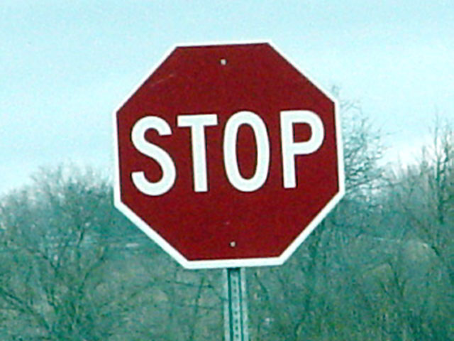
This is much too grainy, soft, and bland in composition. Was digital zoom used? If so I would avoid that in future shots. High ISO? If so I would use the lowest ISO your camera has and use a tripod to reduce noise to the lowest possible levels for your camera. I would also try to find something unique in either the setting or the sign itself and try to more clearly show that or those elements you found interesting.
If you're going to shoot a STOP sign, then you ought to try something creative, other than plonking it dead centre and slightly out of focus! Sorry, but not only are there dozens of them, this is uninterestingly shot with quite unpleasant colours.
An off-centre composition normally helps and a steady hand and sharp focus is essential. Trying to find a reason to relate the word 'STOP' would help too - like a bird flying past or someone walking perhaps?
The quality of this shot is really not the best. There is a lot of noise in every part of it. The sign is not sharp at all, and also slightly tilted. It's placed at dead center, which doesnt really do that much for it either. If you were wanting to do it in the middle I would suggest perhaps a portrait shot rather than landscape so that there isnt much space on either side of the sign.






 Add photograph to your favorites
 Add photographer to your favorites


 Photographer found comment helpful.


