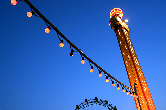
I really like this photo - good colors, subject, balance. I guess the only thing I'm not quite sure about is the inclusion of the ferris wheel. It's very cool but I'm not sure if it helps this photo. It might be enough w/ just the lights and the pole. Overall though still a good photo.
Ahhh. . . .This is a hard one. Getting a carnival at sunset. You did good. I love the kinds of blue background in your pic. A pleasent contrast to the "noisy" orange foreground.
To me, more than anything, this is a beautiful swash of abstract color. The shot is well composed, and the negative space is a gorgeous gradient blue that highlights the orange. The spaces between the light bulb wire are interesting and want to tooth into the ferris wheel like gears. 10
Outstanding color! The Ferris wheel is an unfortunate intruder into the frame. But, when you shoot situations as they occur, we take what we get, right? Technically, a wonderful shot. 9 overall - mjcecil
When I first looked at this photo I thought that the focus was the lights and/or the tower...but after staring at it awhile the focus became the burnt out light and the rest just made it better for me. I think it fits with the challenge of making the negative space around the object be a wow. I really like this the more I look at it.
Looks like it was early evening so your lighting and detail are perfect. Composition is great too but the overall image doesn't do it for me, but thats just personal opinion. Well Done.8-Martin
Composition: I dont think this represents negative space, perhaps if you had cropped out the wheel and lights 4 Lighting: good 5, Appeal: 5, Total Rating 5 Sulamk
Someone needs to change a the lightbulb. The ride in the background I think could have been cropped out and I don't think it would have changed the picture any. Good job. 6






 Add photograph to your favorites
 Add photographer to your favorites


