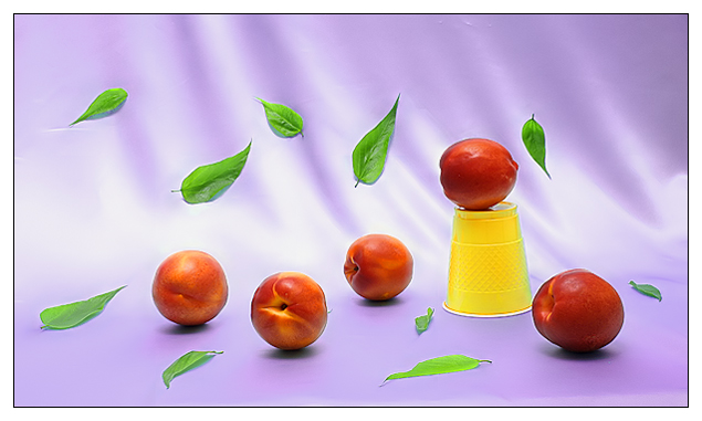
Well if the yellow cup wasn't there, I'd honestly vote higher. I like the composition overall though. But the yellow cup just seems to throw it off. I still score a 7
I like the great colors you used, but this photo seems to be trying too hard - there are almost too many items, and they're arranged just so, so that they seem like an arranged array, and rather than being organized or scattered, they seem to be somewhere in the middle, which is less powerful than the extremes.





 Add photograph to your favorites
 Add photographer to your favorites


 Photographer found comment helpful.


