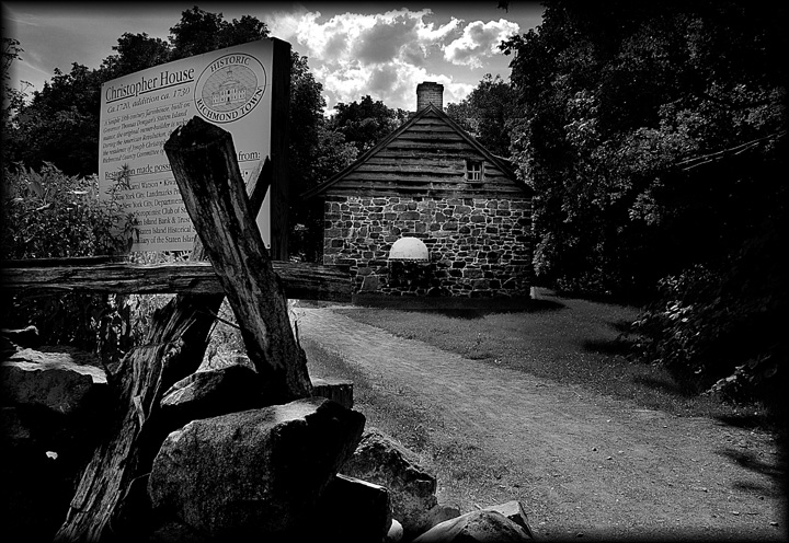
just too much in this one. I would have taken the choice of loosing the foreground pile, and the sign as well and concentrated on the building. The path is nice, but it leads you to the sign, not the house. I am attracted to the bright object in the center of the wall, but there is no detail there. Looking at the blank wall makes my eyes splash off to the sides as well.
Converting to Grayscale reduced the distraction somewhat, but shooing into the sun clobbered most of the detail on your side of the objects.
I don't think the frame was necessary, with so many dark places in the picture I think it is a little much..it is hard to see any detail on the bottom of the farmhouse.
It's nice that the sign showing what this is was included in the picture, but it does tend to make it busy. Putting it against the tree helps. I think it would be better to forget the sign and find a more optimum angle on the house instead of the end view.






 Add photograph to your favorites
 Add photographer to your favorites


 Photographer found comment helpful.


