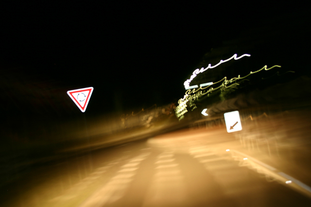
While I like the idea the execution could be a little better. The main problem is the over exposure of the signs. A shorter flash duration might help there. It's hard to say because they are so reflective. A slight bump in contrast and some sharpening should help bring out the signs as well. Perhaps an even longer shutter to get more of the "crazy" lights would increase interest as well. As I said a very solid concept. I wouldn't hesitate to keep at this.
Us Amricans have a hard time with rotaries - noone seems to understand this basic YIELD to cars in the rotary thing! You've got a disturbing angle here and all those squiggly lights - it does reflect how I feel when I'm in a rotary. Wish the rotary sign were sharper, not quite so bright. If there were something else - a car, a person, perhaps there would be more to ancor the eye.
I'm really undecided *argh* I'm not sure how to score this..I can't read what's on the right sign so without the title I wouldn't know what was going on here. It looks like a turnabout, but I can't be sure.






 Add photograph to your favorites
 Add photographer to your favorites


 Photographer found comment helpful.


