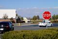
Technical - The sign is certainly vibrant and stands out. It's dead center, which suggests to me that the background wasnt as important in the composition. In the background we have the arm of the traffic light and what looks like the underneath of an overpass or bridge - both of these items have a perspective that appears to be uneven or tilted, which puts it out of balance with the straightness of the sign.
Personal - The text on the red sign has humor, I've personally not seen something like that before so it adds interest.
Overall - Making road signs interesting is a real challenge, but you managed to shoot a nice bright, sharp sign. |






 Add photograph to your favorites
 Add photographer to your favorites


 Photographer found comment helpful.


