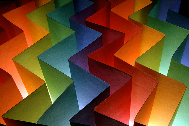
Light Box. Contstruction paper. Did three different set ups but the first two just did not result in a rhythmic composition. They did lead to the third set up, this. Shot with the ambient light of the light box alone with the camera on tripod and using the cable remote.
Post: Convert from raw in PSElements 3.0 with a +0.33 exposure compensation. Layer adjustments for levels, brightness/contrast and hue saturation. Sharpen. Spot edited dust and marks on the paper. Resize. Sharpen.
Title: A music marking meaning broadly.
***************************************
It was very long week. Thanks for the new PB and the great comments. I think I'll eat now. :)
Do you ever get a little down after a ribbon, especially when your next too entries are at about 5.5 to 5.8? Well a little KODAK POTD for 08/07/2007 will perk you right up....it did me:
Statistics
Place: 2 out of 159 Avg (all users): 7.2590 Avg (commenters): 7.9500 Avg (participants): 6.9091 Avg (non-participants): 7.4881 Views since voting: 11436 Views during voting: 261 Votes: 139 Comments: 62 Favorites: 38 (view)
I like the multitude of colors in the potrait. However I felt that there were a few bright spots, which might have been easily eliminated, but maybe elimination of those spots would give the image a dull look.
I absolutely love this image. The idea is one that I'm sure I will create a variation of (well, try to anyway) at some point in time (not for competitions). Well deserved ribbon!
Really nice shot Rob. Using different colors on opposing sides of each piece of paper really makes this very appealing. Congrats on your red ribbon an a new PB.
Now this is how you make an abstract! I am so sorry to have missed this, would have given it a 9 at least, but you didn't really need my score. Congrats on this standard setting, well lit, symmetrical abstract.
The multicolored paper shots are so tired on DPC that they have to hit everything just right. Well, yours does! The fine texture (never easy at 640!), deep DOF, full tonal range, good composition, and of course the colors.
I like this shot alot! I think that there is not a "perfect" evenness between each layer sets this shot off perfectly. The mash of colors is eyecatching and extremely pleasing to the eye. The only thing (!) that disturbs me on this shot is the mark on the red layer, about 2/3 of the way up. Not humongously horrible, but does detract from the overall shot. Way to go!! (8)
Meets challenge, lighting isn't bad, nicely focused. It's probably hard to find a novel approach to this sort of subject as its been done quite a lot, but this is pretty good.





 Largamente
 Add photograph to your favorites
 Add photographer to your favorites


 Photographer found comment helpful.


