Nikon D50
2007/07/20 13:08:41.4
Compressed RAW (12-bit)
Image Size: Large (3008 x 2000)
Lens: 18-55mm F/3.5-5.6 G
Focal Length: 26mm
Exposure Mode: Manual
Metering Mode: Multi-Pattern
1/50 sec - F/5.6
Exposure Comp.: 0 EV
Sensitivity: ISO 200
Optimize Image: Custom
White Balance: Direct sunlight
AF Mode: AF-S
Flash Sync Mode: Not Attached
Color Mode: Mode IIIa (sRGB)
Tone Comp.: Medium High
Hue Adjustment: 0°
Saturation: Enhanced
Sharpening: Medium high
Image Comment:
Long Exposure NR: Off
Post processing:
Export to TIFF from Picture Project
Perspective Correction
Color adjust Levels
Color Adjust Channel Mixer (monochrome convert)
Color adjust levels
Digital Camera Noise removal
resize
Color balance (5500K) to give it the blue hue
Unsharp Mask
Export to JPG
Statistics
Place: 21 out of 159 Avg (all users): 6.4245 Avg (commenters): 6.7000 Avg (participants): 6.0000 Avg (non-participants): 6.7284 Views since voting: 1265 Views during voting: 197 Votes: 139 Comments: 16 Favorites: 1 (view)
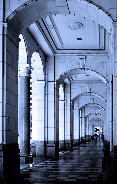
Well I don´t have a lot to say about this image as I find it very pleasant to look at, it´s a good shot but I still think I would not have voted it higher than a 6 if I had voted, mostly cause even though it´s a pretty good image, it doesn´t really grab me either.
It´s well composed and exposed, the depth of the image is great and it meets the challenge head on. I am not sure I like the blue toning but it´s not bothering me much either, I would have to see the shot with a more neutral color cast to decide wich I would prefer, like I said, this is nothing that is bothering me much and I completely understand why you chose the blue cast.
Post processing is nice, only thing I would have done diffrently was to even out the lighting a bit, darken the areas that are the brightest and brigthen the darkest areas but not by much so the image doesn´t loose too much contrast.
I just think this image lack´s that certain something to make it really pop off the screen, maybe something extremely interesting at the end of that hall? Don´t know...
Anyway, congrats on your new personal best :) Kind regards from Iceland, Lárus.
there's plenty of rhythm here and it works well--it just does'nt have a "WOW" feeling to it. Perhaps if you chose a different tone or hue to it, or even make it a bit darker to add a sense of mystery--it would problably add more visual impact. good potential here.
The whole thing feels like it is tilting to the right to me. Other than than, it looks great! I like the blue tones and the composition really draws me in.





 Add photograph to your favorites
 Add photographer to your favorites

 Photographer found comment helpful.


