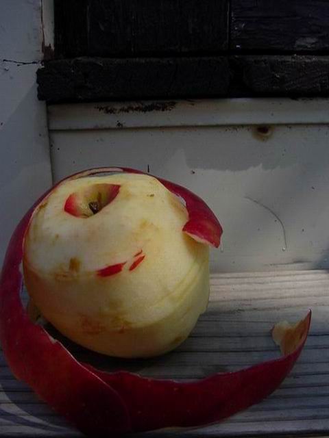
Clever idea! A little dark unfortunately. Background on top is distracting since I can't make out what it is, yet it occupies about 25% of the image. You don't need it so you could crop it. I like the surface the apple is on. Good luck in the callenge. Gracious aka Grayce
Neat idea and picture but my monitor shows a lot of loss of detail in the lower right were the shadows are dence and a black blob across the top. Can't hardly wait for square formats.
Well arranged composition. The weathered backdrop and roughly peeled apple work well together. I would personally like to see the quarter-tones lightened a bit so the apple might round out a little more. Nice picture. --JPerez
This is a superb idea, but there are a few things wrong with the shot. There are two main problems. Firstly, the lighting is very low. While this might be intentional - judging by the title - it doesn't actually work. Primarily, this is because of the background. It's difficult to determine where the subject ends and the background starts. This could be improved by choosing a much brighter (or darker) neutral backdrop. The various scratches, dents and dark shadows distract from the already hard to see central subject. Try using a plain backdrop for the shot to remove the distractions. Next, try lighting the subject with a bounced or heavily diffused flash. White paper held at angle in front of flash unit works quite well – but be careful of your ceiling colour, if it isn't white, you'll get a colour cast. This is only my opinion and I hope I haven't caused offence… Good luck… Keep shooting…
all in all the photo looks a little dark for me, and i'm wondering why you chose the background that you did. it distracts me a little from the apple. interesting title. -- gr8photos.
Cute idea, was the darkness representing the desire for privacy, or something like that? (If not, it's too dark!) Naked apple! Would this be a PG shot or R? 7 Swash





 Add photograph to your favorites
 Add photographer to your favorites


