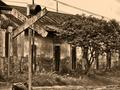
This is a refreshing take on the signs. Nice composition. This is in my top 5 for this challenge. Great placement of the sign and the tree. Good color selection B/W, and good crop.
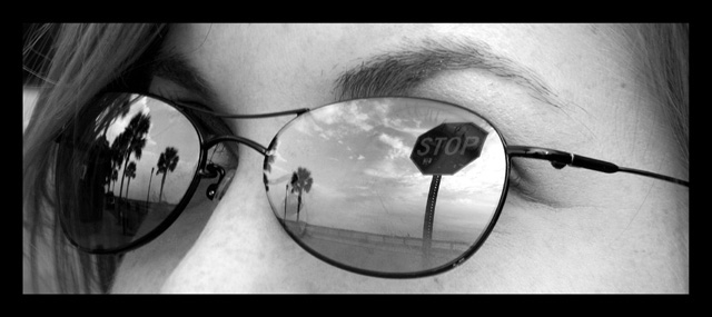
Good idea. I think taking the photo so a little less of the eye is visible would have helped. But I am not sure if that would have gotten the camera into the reflection. Overall I like it.
I like the relection (the intverted bit works well) the trees on one side the sign on the other. I like the horizontal composition, the b&w simplfies it and allow the glasses frame to frame the picture. Nice tones and range. Good work with the focus too. Looking close I realize you can see her eyelashes and eye a bit through the lense, make it look like she is looking out of the sky. I only wish for a bit more "meaningful" title. 9
Well done! One of the more original entries, nicely composed. I might have have called it - Obstructed Vision. (like to see the color version sometime)





 Add photograph to your favorites
 Add photographer to your favorites


 Photographer found comment helpful.


