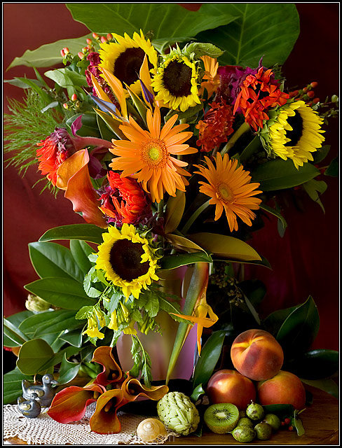
Very nice...I usually don't like such busy compositions but this really works with all those wonderful colors. You can let yourself relax and enjoy the abstractness and shapes, or you can focus in on specific elements...well done 10
PS, I like the choice of red background instead of black for what it is worth...
I would have given this a higher score except you have the image too squeezed in and you have to much stuff that are unrelated. It's like you threw in whatever you had handy. Sometimes less is better. But you have good color, good focus and good lighting.
At first, I thought the image is too cluttered, yet everything is clear & sharp. There's a lot to look at here; and that makes it worth looking at longer. My only suggestion is that a bit more negative space would help frame your subject.
Yes Van Dael, I get it. Great effort. Expensive!? The arrangement could have used some work through the top though. I know it's van dael but there is a lot going on, you could have got a good still life just from the bottom right corner and the calalillies(maybe spelt wrong). At least this is what i would really call a still life. i like.






 Add photograph to your favorites
 Add photographer to your favorites


 Photographer found comment helpful.


