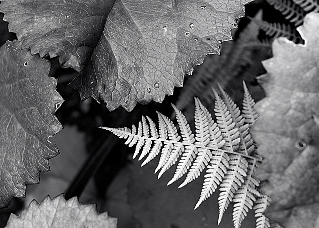
I almost left a comment on this during the challenge but ran out of time. I gave this a 6. I love the lighting on the fern. The detail and texture on the leaves is beautiful. The only thing I did not like was the blurred out leaf on the right. It seemed out of balance with all the other leaves. However, excellent choice for black and white!
Me likey muchly. My only suggestion would be to crop out the blurred leaf on the right. Blur can work, but in this case because it's the only thing not sharp, it draws my attention away from the main subject. That'll change it to a portrait orientation, but you could also crop out some of the stuff at the top if you wanted to keep the same proportions.
Inspired by Ansel perhaps? Great tones and I like your choice of DOF. I wish there were more leafs around the fern though. Still you've really captured everyday things in an artistic way. 9




 Add photograph to your favorites
 Add photographer to your favorites


 Photographer found comment helpful.


