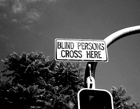
Yes the sign is to warn the drivers. The cropping was done deliberately to create the illusion that this sign is for the blind. As you can partially see the traffic light under the sign is actually lights for drivers. (though I still don't know how the blind people know they should be crossing there...) I did realised the sign (which I'm trying to emphasize) is only taking up a small area, but the sign is quite far away and with a "zoom-less" camera, I can only do a bit of cropping. I also wanted to add a bit more composition such as the curve and traffic light to it, and position the sign close the the center, so it ended up this way.
Good ironic sign. You just can't believe that someone would put up a sign like that unless you actually see it. Picture is a little bit dark. Good find on the sign.
First reaction is the humor quality of the sign. Yes, it's a sign to warn others, but it could so be taken as a sign to blind people to cross there and that's where the humor stems. Unfortunately the composition doesnt really do much for me. I like the curve of the pole but it feels like the whole thing only occupies a small area of the shot and the negative space doesnt really help it. A crop suggestion might be to have the top of the curve coming out of the top right corner and crop to the left of the sign, and unless there is a reason to crop below the sign, I would probably have made it a vertical composition rather than landscape. I believe that way the emphasis would have been more on the sign. I do like the use of the black and white, and the slight noise in the sky gives it a gritty urban feeling too.





 Add photograph to your favorites
 Add photographer to your favorites


 Photographer found comment helpful.


