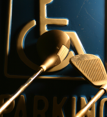
It took me ages to figure out what you meant. Of course once I did it becomes all too obvious. The photo is nice and sharp but I think a little dark behind the clubs. I think also that removing the dirt and scratch marks would improve the photo. Creative and clever though.
I like the golden tones and the dark blue of the sign, and also the slightly raised texture too. To be quite honest I have no idea what this is all about. I assume it's a disabled sign and what looks like golf clubs. I could guess that this is referencing a golf handicap but that's pretty far out there. Light and shadow is good, but the composition just looks like a chaotic mess to me, sorry.
very nice tones here, a rich golden sepia, yet with a comanding blue still in the picture. i agree that this works best with a close crop, but maybe you came in a little too close on this one where the iron gets cut off. also, do we have to see the "parking" part of the sign? it kind of sends a mixed message at first becaue i think about driving, then golf. Perhaps the symbol alone with the clubs would work better?






 Add photograph to your favorites
 Add photographer to your favorites


