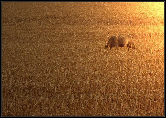
Why two people have said the bright spot is on the top left, I don't know? But I must say that the bright spot looks like it was added after the picture was taken. Whether it was or not, it is a little distracting. A more even light distrobution would be preferred. Good shot.
An almost great shot - just that area of over-bright distortion top left, which is a shame, but hopefully won't hurt your votes too much. Without that, I think greater contrast would help bring out the interruption of rhythm caused by the cow more, but I guess that bright area prevents that. 8
Well composed and great colour, I am a lover of simplicity in pics and this is a good example of it working well. Personally, I would have preferred the picture without the bright corner and just the gentle graded shades from right to left.
but that`s only my opinion.
Well done & good luck with it.
Very very nice. Love the light source (although it looks surreal enough to be added after the fact), and the 'Wheat Frame' of the cow. This would have done very well in 'Negative Space' challenge as well. Great job.





 Add photograph to your favorites
 Add photographer to your favorites

 Photographer found comment helpful.


