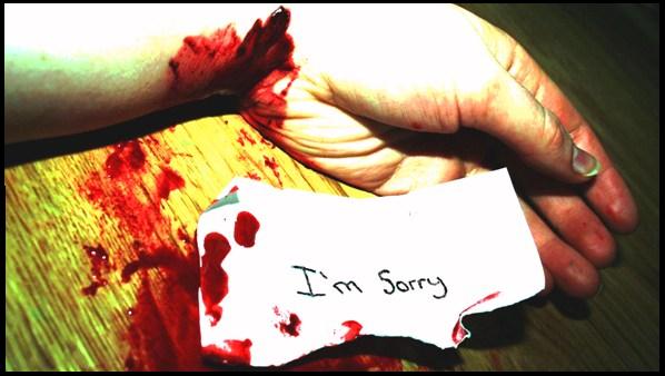
I just don't like the way the arm & hand are blown out at the top, and the green tint to the thumb nail. I like to see the effort at a good set up though!!
You know, I don't really like the lighting as it's pretty harsh but I think it kind of works here. It gives this photo that "Blair Witch Project" kind of look.
Not the best picture and there are several suicide shots but I have to say, the "I'm sorry" note is a great touch. Makes me sad despite the fact that it isn't the best picture. Work on your lighting...the hand has blown out highlights. Again, great job on the note...you were close...
Outstanding shock value, I think the resolution is a little high, and I probably would have went a little softer then sharp, but thats just a Monday morning QB opinion, Congrats on a great Idea. Wish you the best
This really does portray the desperation and is extreme in emotion! The one criticsm that I have is that it appears to be "overprocessed"....almost posterized. I know that I like that kind of thing, but it seems that the voters in here just don't like a lot of processing. *sigh* Are your scores reflecting that???? (Just curious)






 Add photograph to your favorites
 Add photographer to your favorites

 Photographer found comment helpful.


