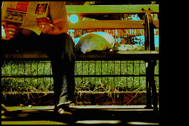
This was a night shot so the coloring wasn't that off ;) Though the wb could have been set tungsten to lose the red glare. Yes it was a bit noisy to bring out some of the shadows and the whites did get a bit altered to tone down the bright light. i thought more people would comment on the photo sliding off the frame. i feel good knowing a gave people comfort in their own work to bash this ;) i'm sad i got this close to the brown but couldn't quite pull it off.
I suspect this will be underrated, as it is so different. I find it quite artistic, however. I really like the odd green tonal choices. The only distracting element is the blue circle next to the guy's arm.
the composition is strong, but other items take it out of strength for me. The bright blue spot, the strong shadows, the fight for visual attention that is going on with the lettering, over saturated blues, the lettering behind the fence, the large black post and the sack on the bench.





 Add photograph to your favorites
 Add photographer to your favorites


