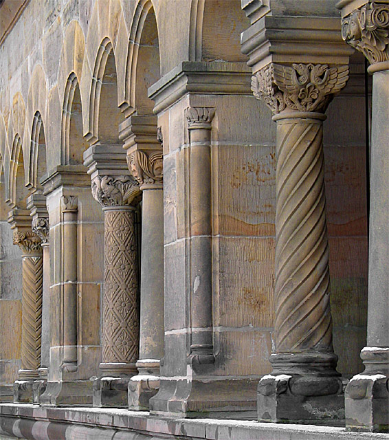
Shown are some columns at the "Kaiserpfalz" in Goslar. A Pfalz is a castle used by the German Empirer in the early Middle Adge when travelling from one place to another. The castle was build in the 11 century and was restored in the 18-hundered-something.
Postprocessing:
Rotation, cropping, change of saturation, enhancement of orange/red hue, taking away a tiny metal piece,
unsharpening.
Statistics
Place: 38 out of 124 Avg (all users): 6.2123 Avg (commenters): 6.8421 Avg (participants): 6.0460 Avg (non-participants): 6.3280 Views since voting: 2276 Votes: 212 Comments: 22 Favorites: 0
LOvely columns, I think that you might possibly want a very small crop on the left, just to bring it to the last arch and lose the very little triangle top left, otherwise fine image. Anne
Great example of architecture! Overall this photo is great. The repetition of column textures. The texture of the snow! Overall texture.
The lighting of this photo is a little dull. Your perspective is great. The slant of the photo gives the eye somewhere to move. Movement is great in a still life photo! If I were the editor of National Geographic your picture would definately go in this issue! Great Job.
Lovely muted colours, white whites and black blacks. The only thing that distracts me is the top left corner. It may look less intrusive if the left side was cropped out. It would mean losing a column but would balance the picture (I think)
I could see this subject in NG. But I don't think it would be like this. The lighting here is too flat. It needs some drama with the lighting, maybe like dawn or dusk lighting which would give it warmer colors and a lot more depth. I think this lighting has flattened this image out a lot and it doesn't have to be this way.
Careful composition - the lines all come together nicely. I like the patterns and colors of the columns. Lacks a point of interest - a person peeking from behind a column, or sitting with legs dangling... something to catch your eye, break up the regularity of the lines.
Nice shot - challenge met, good tones, could have used a touch more depth to the texture, but I think that comes from this being low resolution - or from too tight a crop, perhaps. One thing - it's 'Roman', rather than 'Romanic', but that doesn't cost you points.






 Add photograph to your favorites
 Add photographer to your favorites

 Photographer found comment helpful.


