Editing:
Converted from RAW.
Cropped.
Cloned a small small section where the paper didn't line up smoothly.
Duplicated layer and added a High Pass Filter set to overlay mode.
Added a Levels layer for a little more contrast.
Added a Hue Saturation layer to remove any colour (although the original image had no colour).
Resized.
Added a little sharpening.
Saved for Web.
Statistics
Place: 3 out of 129 Avg (all users): 6.7837 Avg (commenters): 8.0909 Avg (participants): 6.2000 Avg (non-participants): 6.9730 Views since voting: 9418 Views during voting: 392 Votes: 245 Comments: 39 Favorites: 16 (view)
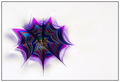
again, this was a last minute voting effort for me, and this image jumped off the page; I kept bumping the score whil eI lokoed at it, then would go back & look at it again! Strong work! I love it, the lines, ighting, the POV and compaition, it is so sleek, and man, I mean, it's PAPER!!
NICE geometry, texture and lighting... the title is direct and simple but being a poet, i think "Flow" or "Fanned" would have given it a little more pizazz. i love this photo. adding to favorites. good luck in the challenge! 9
I love the almost organic shapes you have created here. The tonal range is just right for the image, and contributes to the effectiveness of the abstract. Without any doubt, my favourite of the challenge.
Awesome. You've taken a common, every day thing and presented it in a wonderfully unique way. Great choice on the B & W - it really helps this photo work. Great tones, DOF, lines and curves.
Oh, wow. Very little abstract art does much for me, but this is beautiful! The way those nearly straight lines make a curve from the twisting is lovely, and you cropped it exactly to fit that upper left corner.
Your lighting is also superb - the greys look neat, and I especially enjoy the negative space contrasting with the highly textured areas of the paper edges. I'm sure you know all this already, but hey, I'm delighted to see it!








 Two Reams of Paper
 Add photograph to your favorites
 Add photographer to your favorites

 Photographer found comment helpful.


