If I may venture one advice, you should avoid direct sunlight for a portrait. Well I guess there are no rules, but this one is a good place to start. If you look at the pictures in this challenge, you'll see that the best ranked one where you can see similar direct sunlight spots on the subject is #49.
One issue (among others) is that the "dynamic range" of your camera is limited. That means that your camera cannot render strong lights or deep shadows as well as you see them. Those sunlit highlights are almost always going to appear "burnt" (no details) like on her leg or her shoulder.
Furthermore on a more artistic perspective, it gives very harsh contrast. So unless there is a direct artistic quality to that, it's more likely to be detrimental. Highlights are usually catching the eye. And of course bringing the viewer's eye to a place of no interest and burnt highlights is not what you (usually) want.
The usual result more often than not is that this will give your photo a "snapshot" or amateurish look.
Most of the time, you should try to avoid that. There are many ways to do that such as: shooting when the sun is low (very early or very late), shooting when it is cloudy, shooting in the shade, shooting inside with diffuse light coming from a window, shooting with the sun to the back of your subject so that the illuminated part is "behind" and does not appear (but this raises other kind of issues too, like flare etc).
There are of course exceptions. For example . Here the sunlight is harsh, but the photographer tried to use it purposely not randomly. Because the whole of her body is lit, it draws the eye to the main subject. And the photographer managed to keep enough details in both highlights and shadows (he himself acknowledges that there are some issues in that respect), despite harsh conditions. Probably helped by a little post-processing?
I hope this post will not seem inadequate to you. I personally dont know much, but always found DPC to be a helpful site to learn thanks to other people ideas and comments!
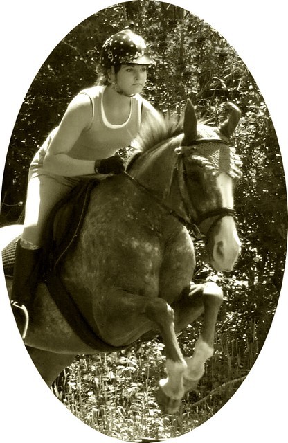
The original had too many competing/clashing colors, so the greenish-sepia was my choice (and I still like it, in spite of the comments, lol). But I agree that a bit more contrast would improve it.
I was a bit frustrated by the cropping and ended up w/ the oval, even though I wasn't happy w/ it. I would have preferred transparent to white, but my software wasn't cooperating and I never did figure it out.
I also considered having the horse jumping out of the frame (I've actually done similar images), but wasn't sure it was legal (is it?), so it was funny that DistantColours suggested it.
I met my goal (higher than 300), and I think 4.8 is a good place to start.
The border really does a disservice to you here, it's very distracting. As for the image, the tones seem a bit flat and the lighting isn't the best. Not too much emotion is conveyed, I feel maybe... concentration.





 Add photograph to your favorites
 Add photographer to your favorites


 Photographer found comment helpful.


