Author Thread
Post actions
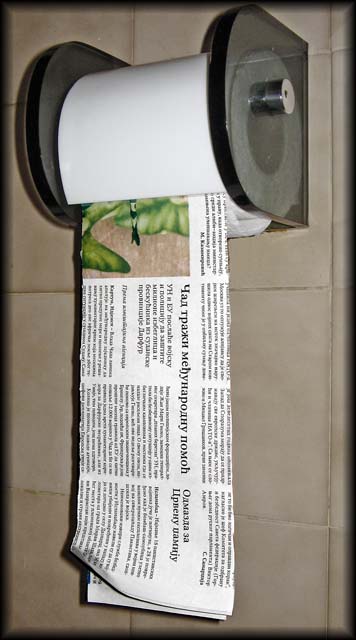
To all who asked: This is neither Greek nor Russian. This is Serbian cyrillic
Comments Made During the Challenge
Post actions
Funny. The lighting seems a bit harsh and doesn't help the "paper" separate from the wall.
Post actions
Post actions
Now - if only I could read Russian, this could serve two purposes! A fun idea.
Post actions
ha ha, great thinking, not really sure if I would really want to do that, but you got the point here, 8.
Post actions
cool idea...although your bound to have newspaper ink all over your butt from this one...lol... 8
Post actions
Post actions
It's a good angle for the photo, but a strange angle for the lighting. If you can, get the light up above, where it will look more natural.
Post actions
Good concept, but the paper should be wrapped around the roll. What is this, Greek, Russian or what?
Post actions
those were the days in the old sovyet 7
Post actions
The contrast is a little too high on this one. Also, I dont like the border.
Post actions
looks like russian or something. Shadow is a bit too harsh for my liking.
Post actions
The use of flash is too harsh.
Post actions
I like the idea, but you should have put some more effort iinto this, it's obvious you just sicked the paper under the cover - woulda been better if the whole roll was made out of newspaper. the border distracts, the aspect ratio is strange, a little more space at left and right woulda been good.





 Add photograph to your favorites
 Add photographer to your favorites


 Photographer found comment helpful.


