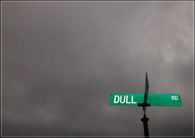
The first few shots I took of this had no detail in the sky, just a white featureless background. I felt that was a little TOO "Dull". Through
efforts to capture a little more detail in the background, I realized that instead of using the overcast sky to echo the "Dull Rd" text, I should be contrasting the sky with the sign. A little flash really separated the sign from the sky.
Post processing:Levels, Hue and Saturation, Brightness and Contrast.
Statistics
Place: 9 out of 202 Avg (all users): 6.6181 Avg (commenters): 7.6774 Avg (participants): 6.5000 Avg (non-participants): 6.7113 Views since voting: 2806 Votes: 254 Comments: 37 Favorites: 5 (view)
Excellent observation and a brave entry, since many people may vote based on their instant reaction to a 'dull' scene (which this is not). A good first attempt.
If there were an 'almost but just fractionally not quite' favourites thing here this would be in. Just that little element that keeps it out of there for me. Great submission though, and quite a standard you've set yourself.
Very appropriate sign. I like the contrast between the green and the gray. A little noisy in the sky but not a distraction. I like the very low placement of the sign in the frame. Well done.
Wonderful shot. The angling of the road-sign bothers me a touch (a very small touch, I should add) - had I taken it, I'd have tried to get a sqauer-on view, to lose the angle of the other arm of the sign at least, and to give a more regular shape to the two visible arms: in a composition this oddly geomatric, that distortion becomes quite important I think. 9
Witty photo that has the look to pull it off. Good job. This is one of the few photos here where a bright and obviously placed sign sticks out in an appealing way, not in an obstrusive or annoying way! It suggests sarcastic commentary to me, which is excellent. Good sarcastic photos are hard to come by.
Funny. Glad my address isn't "Dull Rd." It is a nice idea - those thick blank clouds, and -pop- at the bottom the green sign. Still, I'm made curious what is beneath the sign.
of the signs that "say what they mean," this one is the best. Nice work on the saturation/desaturation. good composition with the angle and the negative space - it would have been nice if there wasn't a bisecting sign, but you can't help that and your choice of angle shows just enough of it so that it doesn't intefere but doesn't look like you tried to hide it either.






 Add photograph to your favorites
 Add photographer to your favorites

 Photographer found comment helpful.


