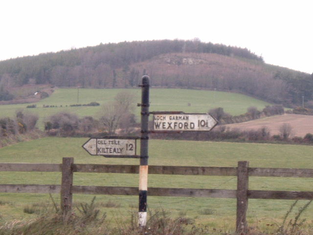
Initial thoughts/My opinion Great antique road signs! Too bad technically it's not too well executed.
Content/Composition The content of the image is very well chosen and showing not only the old sign but also some of the surrounding landscape was a wise choice IMO. You might have composed the image a little different by either placing the sign more to the left or right or maybe even center it. The way it is now, it's a little indifferent. I would have placed it according to the nicer background.
Camera work -technically The focus seems more or less fine, although I do not want to call the image sharp. Exposure could be a bit darker. Everything looks pale.
Digital Processing - Technical I think that via post processing the image could have been made much better.
B&W or sepia might have been a wise choice, especially for strengthening the antique feeling. A bit more contrast as well as adjusting the brightness might have been good too. Another step of improvement would have been sharpening the image a bit more and maybe (that's a matter of taste) add some noise/grain to it to make it look even more old. You should also have rotated the image CCW to make the sign post vertical.
Good sign and background. The shot lacks a bit of focus and contrast. The background is washed out (but it looks like that kind of day, so it was probably unavoidable).
I know the hills in the background add a nice touch to the entry but I think you could have cropped the sky a bit closer. And the picture seems a bit washed out. Adjusting the levels would help in this situation to add more contrast and reduce the effects of haze.
Technial - It's not a very sharp image and the colors are quite muted. Having the sign dead center gives balance to the two opposing directions but I think it would help the composition more if it had been on the third. The amount of white overcast sky helps give it a washed out feel. The fence is also slightly tilted.
Personal - I like the old style signpost, I think it has great character and is a good subject to shoot.
Overall - I think if the conditions on the day you had shot this had been better then the image itself would have been better. It does have character but the muted colors and lack of sharpness go against it.






 Add photograph to your favorites
 Add photographer to your favorites


 Photographer found comment helpful.


