Applied dodge and burn to main subjects
Warmed using 'color' layer blend
Spot edited to enhance blue sky
Applied levels to aid contrast and enhance sunlight
Statistics
Place: 50 out of 124 Avg (all users): 6.0433 Avg (commenters): 6.7000 Avg (participants): 5.6098 Avg (non-participants): 6.3254 Views since voting: 1277 Votes: 208 Comments: 23 Favorites: 0
When I first saw this during voting, I thought, 'how English'. As a Scot, you can imagine what I felt.
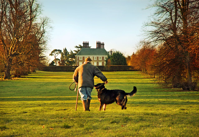
Actually, as a photograph, I like it. It's well balanced, has a clear subject, shows the theme very directly and successfully, is exposed beautifully and is in sharp focus.
I have no problems with the composition. That the human is walking away is more appropriate to a generalised scene than the other way around. And that co-ordinates with the colour scheme - evening, coming home. Colours overdone? Not for me. Just fine and dandy.
I'm afraid that I'm not going to offer much in the way of constructive criticism this time. That's because any problems I have with this shot are my own problems, not with this shot. I'd have given a 7 had I voted. (Maybe some brightening on the dog's coat would have helped a bit. And not obscuring the head with the building might have cleared up some visual confusion.)
If you have any comments on this critique, please feel free to contact me.
Very beautifully composed! Shows action in it's simplest form! Just a touch more detail in the dog and it's perfect... Can't wait to see who and where!
TC
Slice of British life. Lovely green, lush grass, frames by the trees on either side. Very orderly and pleasant. The man with the cane climbs briskly toward the house, his dog give weight to the word "master" in the title. Wish the composition of man and dog could be more harmonious - the dog doesn;t seem to be heeding too well.
I would be tempted to submit this to horse & hound, country life etc.
Wrong aspect for a cover but I think it could be used. The sky would allow text to be placed perfectly without destrying the subject
A good human interest shot. Good composition and colors. It seems odd that you didn't ask them to turn towards you, like they were protecting their property or greeting you. A pretty picture anyway.
I love the colors here, very nice. Composition is really good. The only thing I would suggest is crop a smidge off the right. But the range of colors is absolutely gorgeous! Love this shot!
looks more like Home & Garden than National Geographic. Attractive light and subject, though would prefer the guy to be looking/ walking towards rather than away from the camera ?





 Add photograph to your favorites
 Add photographer to your favorites

 Photographer found comment helpful.


