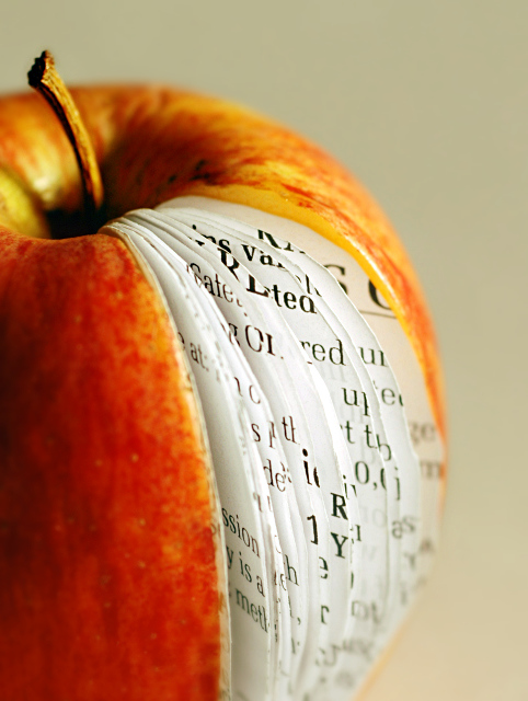
I know the secondary subject, apple, is not entirely made of paper but the primary subject is paper here. I tried to keep the apple (the real part) as much out of focus as possible and most of paper sheets are in perfect focus.
The photograph and the "iBook" concept doesn't have any meaning without those sheets of paper, so I consider this as a "paper shot". I hope people see my point/concept and I don't get dnmc-low-votes.
Post-processing is minimal and according to basic editing rules by the way.
Statistics
Place: 1 out of 129 Avg (all users): 7.4025 Avg (commenters): 8.2857 Avg (participants): 6.9273 Avg (non-participants): 7.5470 Views since voting: 12276 Views during voting: 620 Votes: 236 Comments: 75 Favorites: 29 (view)
I love this creative concept and you did a wonderful job in presenting it! The lighting is great for it illuminates all the elements within. Colors of the main objects are wonderful however the backdrop does not truly compliment the scene. The dull cream/brown tone of the backdrop doesn't allow the iBook to contrast sharply or 'pop' visually off the page. A higher contrasting hue (generally white or black) would make the main object pop off the background more. Kudos to you for cutting out the pages to the size & shape of the apple. That must have been challenging and a bit time consuming. You did a excellent job in placing the pages in that sliced apple for they really do look like it belongs there. I know you mentioned that you purposely 'softened' most of the apple during exposure so that your primary subject of the paper pages would stand out more. But the drawback was that the bottom half of the pages are not as crystal clear and sharp as the top half of the pages. It still went over well with the voters but I wonder how much more appealing it would have been in the final tally to present a sharper & more detailed image with the full pages and apple in sharp focus.
Thanks a lot everyone for votes, favorites and most importantly leaving nice comments throughout the week. Just because of these comments, I am actually happier with this ribbon than I was when I got the first ribbon.
This is my third entry with an apple. Earlier entries were,
"torture" (challenge Hate) and
"exit wounds" (challenge Exit).
I guess, my "apple fetish" finally delivered me a ribbon hehehe :)
Thanks.
Very nice image - I see it as the fruit of the knowledge of good and evil - or if you prefer, the 'apple' Adam & Eve ate, which gave them this knowledge.
Certainly, there is a reference to eating or ingesting knowledge, and of course there is the Japanese rice paper, which is designed to be eaten.
Quite a complicated symbolic image, and well done for getting it all together like this - it must have taken ages with the scissors getting it right, and keeping it dry if it is all in situ.
You should be in advertising if not already!
Cogratulations - I would not have been able to be that creative
What a great concept (very Scalvert-esque!) I think the composition is great. It might be better if you maintained more DOF (th bottom right gets pretty blurry). Also, I think it would have ben more aesthetically pleasing to bring out the red in the apple. Great title.
Creative and well shot. Some small details- the paper doesn't quite match the profile of the apple. The dof doesn't quite feel right with the front of the apple oof. Overall nice with a great 1st impression.
Apple's latest product? Creative. The paper edges don't quite match with the apple and it would be nice if you could have smaller text and have it wrap within the curved boundaries. Good DOF and coloring.
very creative shot - love the composition and concept. I think this could have been just about perfect if there was slightly better cutting of the pages on the left hand side of the slice - a couple of the pages don't quite line up - but that is being ever so picky!!! 9





 iBook
iBook Add photograph to your favorites
 Add photographer to your favorites

 Photographer found comment helpful.


