Author Thread Comments Made During the Challenge
Post actions
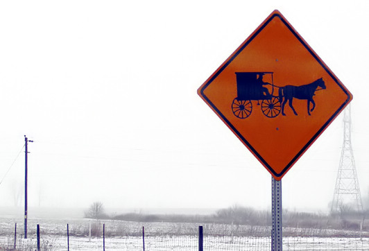
I think I would have prefered if the tower was not in the image.
Post actions
Kind of romantic! I like it!
Post actions
This would look great in B&W
Post actions
This is great - just a little more to the left would have been perfect.
Post actions
Why did you choose this composition, to contrast the old and new the pylon needs to be out from behind the sign. Colour contrast is great.
Post actions
I like the sign itself and the color, but the pole on the left is distracting as well as the structure of the right. Good job.
Post actions
Another bleary winter sky. Imagine a nice blue sky as the background. These winter skies look like a wash out.
Post actions
Post actions
seems too gray to me, some contrast adjustment needed. Otherwise interesting sign.
Post actions
I like "high-voltage" in the background even more... If only it wasn't glued onto the sign...
Post actions
I'm not even sure what has happened here. Did you try to desaturate the background or increase the saturation of the sign? Either way it comes off as very unnatural and splotchy. A nice B&W treatment seems like it would have been more appropriate if not leave it in the original color version.





 Add photograph to your favorites
 Add photographer to your favorites


 Photographer found comment helpful.


