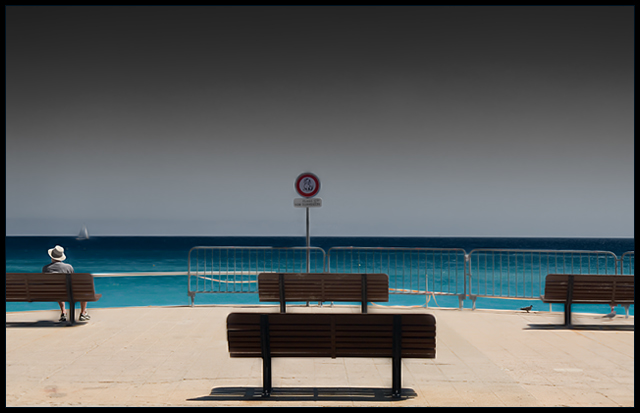
Looks like something out of a Pink Floyd photo. The colors pop but because of the dark empty space on top, my focus is pushed all the way to the bottom. It is lacking something very dynamic to make it a GREAT photo. But still nicely done.
Nice colours and tones. However, the image is actually really annoying, because it directs the eye to the sign in the middle, but you can't actually see what the sign is. The incidental details (person, boat, pidgeon) actually help to add more points of interest in an otherwise abstract photo, so I'm glad you didn't clone them out.






 Add photograph to your favorites
 Add photographer to your favorites


 Photographer found comment helpful.


