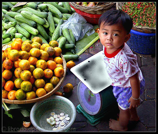
In the market of Bangkapi, Bangkok, I saw this adorable yet naughty boy "helping" his mother sell fruits. Well, I did buy from them so I guess the boy was indeed a "help".
I cropped the picture tighter.
I cloned out distracting parts.
Unsharp masking.
Increase saturation.
Decrease brightness, increase contrast.
Applied Lighting Filter/Render/Spotlight.
Burned some bright areas.
Provided a frame.
Statistics
Place: 4 out of 124 Avg (all users): 7.5899 Avg (commenters): 8.6000 Avg (participants): 7.3516 Avg (non-participants): 7.7619 Views since voting: 7502 Votes: 217 Comments: 47 Favorites: 26 (view)
Your picture the color is nice the saturation is good. The problem is your eyes are drawn to the awful eyesore the bad burning you did on the top of the weight machine it kills everything else in your image because I can't avoid looking at it and I find it the death of your work. I am sorry nobody else is addressing it but its true. You may want to try in the future to try mask that part then lower the bright level there plus think abut the angle and what you see as the light source or object reflecting light. Thank you for he picture though!
Hey Manuel! Great job! Your photos bring me back to my travelling days through Asia. You're handling your 4500 quite nicely! We could learn a lot from eachother!! :-)
This one is the winner in my book. Tremendous use of the theme, colors, and focus...GREAT balance. This photo is one of 3 that really spoke to me...FANTASTIC JOB!
Very good photojournalistic style photograph. Really get the impression this could be an image included in an article on world hunger or agriculture. Technically well done too.
This is so right that I can hardly believe it wasn't in a NG issue recently! The combination of title, meaning, child and brightly colored fruit/vegetables, this is the one.
My favourite in this challenge! The boy fits perfectly in the scene. I like the vivid colors a lot. One minor thing is that the grey plate (?) looks quite unnatural.
I like the choice of angle you have used, being above the subject, as I think it shows his/her vulnerability a lot more than if you had gone down on their level. The expression on his/her face is good too. Looks very much like a shot that would have been featured in NG.
Absolutely awesome shot!!!
This is right on target for the theme and crisp clear color just the way National Geographic would show it.
This is my highest rating so far, but I still have a ways to go. 10+







 Add photograph to your favorites
 Add photographer to your favorites


 Photographer found comment helpful.


