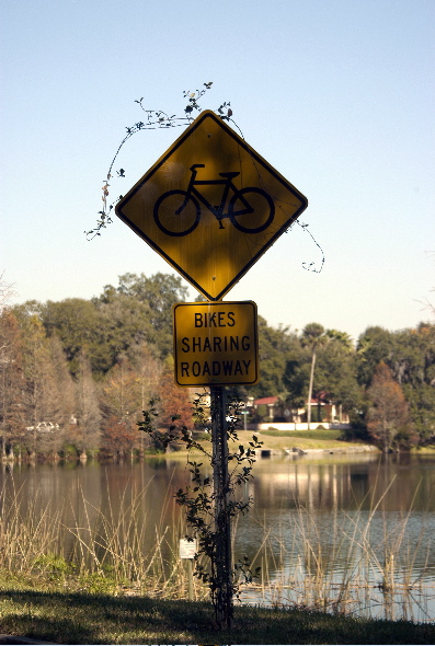
Off-centre composition would have made this more pleasing - and I feel that I should read some humour into this, but I'm not sure where.
Perhaps, if the overgrowth/delapidation is the emphasis here, then you should have taken it closer up, viewed from the ground, and lost the distracting context of lake and houses.
Not bad, but IMHO there ist some space for improvement too. It could have been more interesting with an off-centered position of the roadsign. By using another aparture (e.g. F 2.0), the background could have been more unsharp and less distracting. Nevertheless good luck for the challenge!






 Add photograph to your favorites
 Add photographer to your favorites


 Photographer found comment helpful.


