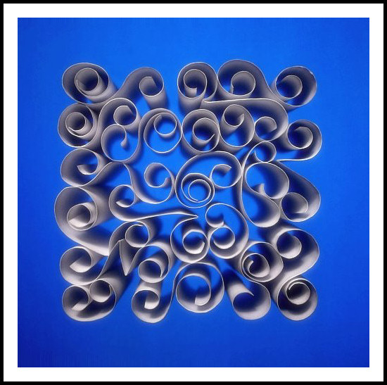
This is recreation of an image I've seen on DPC before. I really loved the effect, and wanted to see if I could recreate it, particularly the lighting. I feel like it's cheating to copy someone else's image, but I learnt a lot, and having taken the photo, I wanted to submit it. I hope it's OK. I can't even give credit, because it has been a while since I saw it, and I don't know whose image it was.
My lighting was a back-light diffused through a white plastic sheet and some blue cellophane, and then a top-light from a desklamp, and using my hand to shield the edge closest to the lamp, so it wouldn't be too bright on one edge. Here's a shot of the setup...
Editing is a bit of skewing to get it properly square (I spent ages fiddling with the paper pieces trying to get it square, but couldn't quite get it), plus levels, spot cloning of dust bunnies (on the cellophane), hue/sat, slight additional vignette, crop, resize, USM, glow filter, levels and border.
I'm getting stuck in a still-life rut lately. Maybe I should go enter the NLP challenge instead, just to get out of this!
Post-challenge: Ah, The original image has been identified. timfythetoo is where I'd seen the original image. Thanks timfy for your inspiration, and for your details comments. Your comments mirror my thoughts about my final results. The sloppy editing is my fault - to many rethinks and last minute editing of the saved jpg. Note to self - don't reload and resave a 640px JPG! Ever! No really, ever! :)
Statistics
Place: 16 out of 129 Avg (all users): 6.3077 Avg (commenters): 7.1429 Avg (participants): 5.7273 Avg (non-participants): 6.4860 Views since voting: 2249 Views during voting: 457 Votes: 234 Comments: 23 Favorites: 4 (view)
This image has the damnest effect on my vision. Parts of it look blurred and then move about as I gaze at it. Weird. Wonder how you achieved this.... or maybe I'm getting cataracts! heheheh Doesn't look precisely centered which I suspect you wanted???? Maybe a version without the frame would have allow the figure to be larger and have greater affect. Anyway this is very good! Bumping it a point as I comment.
Hmmm - this has a familiarity to it that I cant quite seem to put my finger on. ;) If you dont mind I am going to go ahead and give this a proper critique but based off of the issues that I dealt with on mine. First off, the image just doesnt have a smooth feel to it. There seems to be a halo of noise around all of your paper pieces that is a bit distracting to my eye. With it being advanced editing it may have been worth the time to spot blur all around to clean it up. Takes some time but could have been good. I wish the paper was a bit more white or bright. As it is the paper has a drab feel to it. A bit brighter would have allowed it to pop off the blue background better (was it originally blue?). A tighter crop would have been good as well. Right now it seems a bit off balance. I think you have more side space on the right than the left so it feels a bit off kilter. A tighter crop would have also made your paper patterns a bit bigger in the frame. I like the white border but I think the black outside border is just a bit too thick and heavy handed for the delicateness that this type of image is. I do like the variety of your curls. A nice mix of tight and loose curls along with the V shapes are a good combo. A couple extra V's may have been good but overall a good blend. Good gradient on your background color, a bit of blur would have helped really smooth that out as well. On first run through I scored this a 6. When doing an idea that has been done before and scored well you really need to nail it. You really need to make it awesome or else you just end up getting judged against the original. My fear with mine was that I was going to be compared to Techo's images which were amazing. I lucked out big time.
Anyways - I hope this is scoring well for you. I am looking forward to seeing whose this is. Good luck!!





 Add photograph to your favorites
 Add photographer to your favorites


 Photographer found comment helpful.


