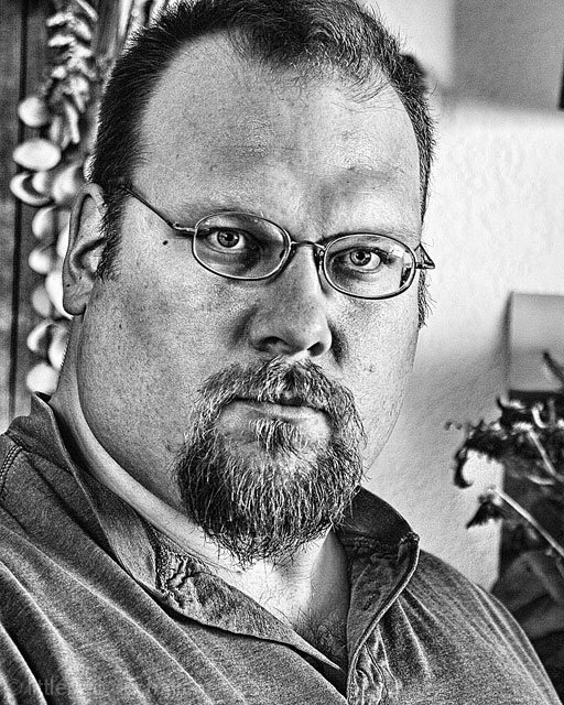
Nice sharpness but, to me, it looks way over processed. Maybe that's the look you wanted and there's nothing wrong with that. It's just my personal taste.
Interesting concept... The self portrait may be in natural light, but the light isn't contributing much to the image itself. Maybe it's the processing that's overriding the main theme of this particular challenge.
I find myself in two minds over this portrait. On the one hand there are elements that I really like - the eyes in particular, but on the other hand there are elements that I really don't like - for example the heavy sharpening. I also find the evenness of the light slightly strange, and I wonder if tone-mapping has been used? I just can't make my mind up about this one - one to re-visit later in the challenge, I guess!
The picture is a little too over-exposed for my taste and also I think that a different t-shirt could improve on the picture, rather than just a plain polo. The background is too distracting for me and I'm almost irritated that half of the flower is cut out of the picture (I'd rather it be all in or all out). I give it a 5.
I love the editing. Great eyes and focus but the background makes it a bit busy. I might've done the DOF differently so that the backround was a bit more blurred. Great lighting and contrast.





 Add photograph to your favorites
 Add photographer to your favorites


 Photographer found comment helpful.


