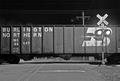
i really like the design element of this shot. It has very simple pleasing shapes, nice colors and a smooth flow. The seems a little light, perhaps just half a stop, but other than that well exposed. The space between the last block and the edge of the frame seems cramped. I wonder if it would look better if it was comparable to the size of the first space, or even half as large. I really like the arrow in the top of the picture, but it would be fun to try playing with different vantage points to put the arrow in a different spot in the image.. perhaps more to the right and lower.. however perhaps this well appear too contrived. Great elements in this photo. keep up the good work.
Thank everybody for the encouraging comments and crtiques. This was my first attempt on DPC because it was on Christmas 2003 that I took hold of my first digital camera.It is great!So is DPC. I'll try again if I have a candidate among my photos.
Excellent abstract visiion of this road sign. This is one of only 2 in this challenge where I have seen true art emerge. Congratulations and good luck. I hope you win! (I hope people don't deduct thinking a painted street sign isn't a sign!)






 Add photograph to your favorites
 Add photographer to your favorites


 Photographer found comment helpful.


