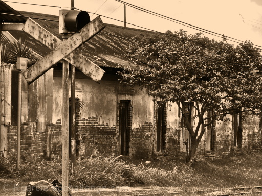
This was taken in my neighborhood at one of the intersections of an abandoned railroad track. The building is more than a 100 years old.
I modified the original to sepia and then sharpened it.
Statistics
Place: 11 out of 202 Avg (all users): 6.5854 Avg (commenters): 7.4000 Avg (participants): 6.4722 Avg (non-participants): 6.6739 Views since voting: 3264 Votes: 246 Comments: 26 Favorites: 5 (view)
I've never seen this. It is excellent. It's fun to find some old images and bring them back to the forefront. Perfect leading line and the post editing is exquisite. I love the overall aged look of it. I can see why it did so well when you entered it. BRAVO
I like the old, sepia feel of this that you've added - it works well with the crumbling buildings and weather worn sign.
The wires through the scene jar it back to reality though and break the mood that you were building I think.
You're right, but I couldn't spot edit for the challenge though. Anyway, I really enjoyed the idea of this picture because I'd been wanting to take it for some time now. Many of my friends really like it, and a cousin even asked for a print in order to use it as a model for a pencil drawing project of his.
I like the picture and the effect, if I were to criticise at all it would be that the sign just doesn't stand out enough. Maybe a different angle would have helped.
Still a good one should do well,
Paul.
This is one of my favorite of the challenge. The worn out R/R sign and the worn down building all fit together nicely here. I actually even like the wires in this shot, they give this a feel of having been left behind to wither away. Great color tone and detail. 8
I like the mood of this photo, it has an old look to it. It might be just me but it seems a little out of focus. There is also a little too much going on in the scene.
Nice old feel with the color. Wish you'd included more of the tracks and bottom of the sign or cropped the out entirely. Nice textures, very different feel than all the bright and glaring modern roadsigns.
Really old. Neat tones, looks great. I would like to see a few of the power lines removed but this is very good. I hope you do well in the challenge. Good luck.







 Add photograph to your favorites
 Add photographer to your favorites

 Photographer found comment helpful.


