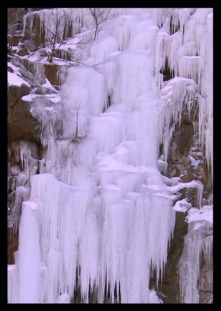
I couldn't find any topless natives- I took this shot behind BJ's in waterbury connecticut. the alternate title was: "How national geographic gave me carpal tunnel."
Statistics
Place: 41 out of 124 Avg (all users): 6.1567 Avg (commenters): 6.8000 Avg (participants): 6.0568 Avg (non-participants): 6.2248 Views since voting: 1915 Votes: 217 Comments: 18 Favorites: 0
First off the bat, let me say, as a resident of Japan, the title was the first thing that intrigued me. I presume you mean Sapporo's Ice Festival? I thought, for a fleeting instance, that you were either a resident, too, or had come to Japan. Now I know, the title has an entirely different meaning to me. Interesting.
The other commentors have picked up on the pink hues. I must admit, they are distracting. Overall, the exposure feels a touch under. There needs to be a sense of glitter in ice shots. So the darkness and the pinkness combine to rob this shot of its most important feature. This weakens the shot for me.
A further weakness is the composition. I feel that I've been thrown into the middle of something. There's no feeling of start - middle - end, which is vital in story-telling and photography. A scene can have these elements, too.
I like the border. Maybe if it were even heavier, the sense of brightness would show through more.
These are my negative feelings. On the whole, though, I think that they are tiny in comparison to the strengths in the shot. It is a good shot. I must say that. And certainly fitting to the challenge.
If you have any comments on this critique, please feel free to contact me.
Boosting the contrast would really add more impact to the shot. The composition is wonderful and interesting. White balance seems to be off and the ice looks pinkish.
Wow. Excellent job with this one. What an awesome find, to start with. The picture is extremely well taken too. There is really good detail, its clear, balanced. I'm not so sure I prefer the pink hues versus doing something a little warmer though, even if it is ice. Great work 9
something about the color balance (white balance) on this isn't working for me. The tones of purple/red are a little too powerful. Excellent subject, nice and sharp, overall looks great. nice work.






 Add photograph to your favorites
 Add photographer to your favorites

 Photographer found comment helpful.


