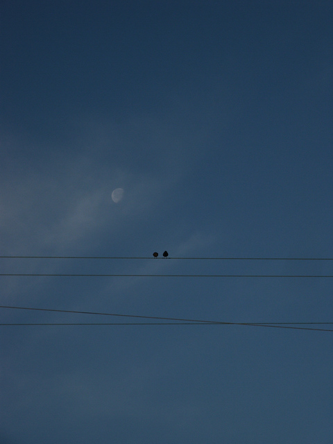
I would have zoomed in on the birds a bit more. You still would have understood the power lines location, and the sky wouldn't be so much of the image.
Creative idea - needs a bit more light. I like the placement of the moon and the birds. A stronger tie to the theme via the title or composition would help.
Good subject and a very lovely picture. There is an overall gray cast that could be corrected (in Photoshop) by autolevels or added saturation (still within challenge rules). It would also have more power if the two birds are offset toward the right side and not dead on center. If you crop halfway from the bottom to the first set of wires and about two thirds from the right border to the first bird and probably about an inch from the top, you might end up with an improved composition. It's a lovely picture, don't get me wrong.
To me your primary subject is the wires. The birds and the moon are a bit distrating. Sorry by my "bad humor", but I undestand the life in city, with these wires splashed over all great subjects. Try to read the rule the Rule of Thirds tutorial, in tutorial session of this site, will help you to define a primary subject.





 Add photograph to your favorites
 Add photographer to your favorites


 Photographer found comment helpful.


