Greetings from the Critique Club Hi Ben,
got you again. Seems we are linked somehow.
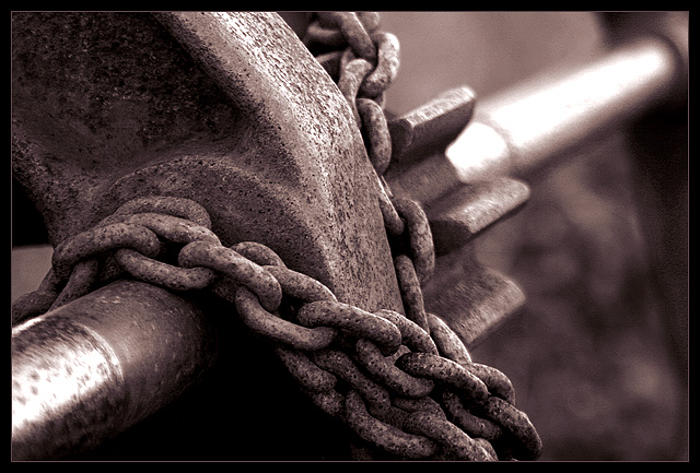
Initial thoughts/My opinion Great close-up, like the texture of the rusty iron. POV not the first thing that comes to my mind. Would make a great image to hang on the wall, maybe as triptych.
Content/Composition The composition is just great: could be a textbook presentation for rule of third and also leading line. I also like that the back part of the axle adds due to its brightness a further element to the image and it is not only background. The shapes (gear wheel, chain and axle bearing) are simple and thus easy to understand and look at, although one does not know to what it belongs. But this is not important.
I like the texture of the metal very much.
Also I like the light: very gentle but still due to some soft shadows enough depth.
I would have composed the DOF a little different though: a little wider with everything sharp starting from the lower left up to the whole gear wheel leaving only the back part of the axle blurred. But this is really the only part where I see improvement.
Camera work -technically Nothing to mention here: exposure, focus etc. just right.
Digital Processing - Technical Very good selection of duo-tone, sharpening set right and the border works great to me: for such an image I feel a border is a must.
Fits the challenge Actually I don't see a special POV in this image, to me it is more a close-up. However, that is really my personal view and I had this problem in one or another way with most submissions to this challenge.
This is absolutely fantastic. This is the kind of photogrpahy I like to look at, and especially in this form. The sepia toning is perfect. It would be a sin to give this less than a ten (10)









 Add photograph to your favorites
 Add photographer to your favorites

 Photographer found comment helpful.


