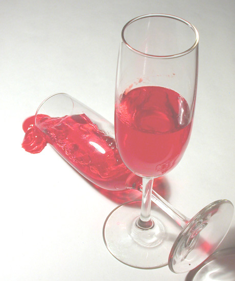
this would have been a cool shot had the colors not been washed out. what happened to the reds? i feel like we are viewing this through a veil. could have used major adj in levels/curves to bring out the reds and deepen the dark areas.
The colours look very pale, I think if you had adjusted the contrast it would have given this shot a lot more impact. Also I find the blown out highlight on the fallen glass is distracting.
Good photo, but it probably would have been better if the glare was not so harsh on the glass laying down and if you could not see the camera in the other glass. Did you use a glaussin blur for effect? Good work!
I like the arrangement of this image, and believe it fits the challenge quite well. It looks like you've worked quite hard to create this image. I do feel that the lighting seems to let the image down slightly though. Apsrt from that, A nice image.






 Add photograph to your favorites
 Add photographer to your favorites


 Photographer found comment helpful.


