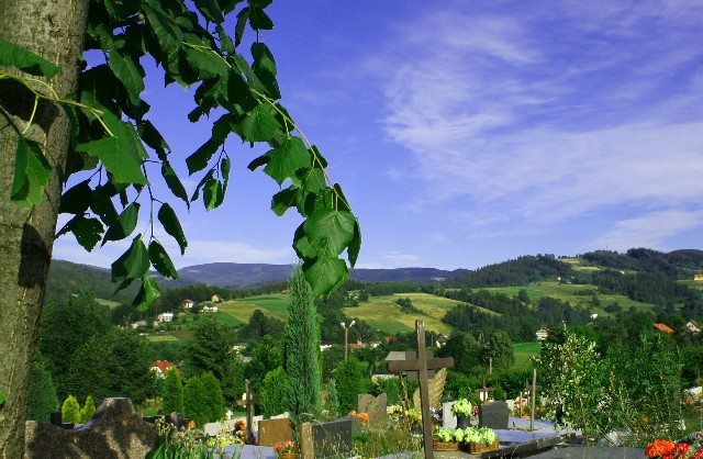
This doesn't really work for me as an image. The composition feels messy - the foreground tree is tilted (which may be how it is in real life but when one can only see this small section of it, just makes the image feel unbalanced to me). The angle we have here makes the graveyard look cluttered and crowded rather than a peaceful resting place and the main cross we can see has it's bottom cropped out. It seems that you can't quite decide whether your subject is the foreground tree, the graves or the landscape beyond.
Nice colours and that looks like fabulous scenery in the background. For me, though, the foreground is far to busy and detracts from the image overall.





 Add photograph to your favorites
 Add photographer to your favorites


 Photographer found comment helpful.