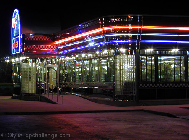
Looks nice with a retro-space age look to it. I like the colors and your emphasis of the lines and windows. I'm not sure the empty foreground does much, but this is an interesting image.
They supplied the brilliant colors; you photographed them perfectly. I like the composition, with the main entrance off to the side, rather than in front where it might be too dominant.
Technical: fits the challenge. Exposure lighting composition focus all good.
Personal: I might have moved just a tad more towards the front of the building to see a little more of the neon sign, but that's just a matter of personal preference. Nicely done shot- looks like a few of the diners in my area (Atlanta)!





 Add photograph to your favorites
 Add photographer to your favorites


 Photographer found comment helpful.


