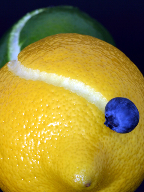
Okay, a couple of more notes. The 'road' was made with a little zesting tool that I bought Friday afternoon. Getting a decent road out of the lemons wasn't too hard - they have nice soft rinds. But carving the limes was a pain! It's impossible to get a smooth road with nice clean sides. If you look at the outtakes, especially the first concept shot, you can see some pretty horrible carving jobs.
This is one of the reasons why I selected the DOF that I did. I could have lit the lime better, and I could have gotten it more in focus, but doing that would have revealed other flaws. Also, my goal was to make the fruit pop out more in the front, and less in the back. I lit the blueberry really well with a large flash to the left and about fruit-level. This really lit up the blueberry, but also killed any shadows, which may be one reason some people thought I added the berry in later. I tried hard to reduce the glare on the lemon, but in the end it seemed to be a compromise between the berry brightness and the lemon glare.
Also, someone asked how I got the road to be so bright. The lime rind tends to be a brighter white then the lemon anyway. But to enhance the whole thing, I spread a little vegetable oil along the road with a q-tip.
I have just read how you achieved this shot... It's not only the oddness that sets it apart, or the fact that it's a well composed shot, but because 90% of this shot is the idea itself – tooth picks, who'd have thought it. I joined this site for tips on how to improve my photography and you've provided this week's lesson… Thanks for telling…
Thanks everyone for the comments, especially from KarenB who called it "wonderfully bizarre", which is exactly what I wanted this to be.
To answer the various questions.... there's nothing weird going on here. There's a lemon, a a lime, and a blueberry. The lime is kind of proped up on a tripod of toothpicks, and the blueberry is stuck on with another toothpick. The only PS changes are auto-levels and auto-contrast. Heck, I didn't even know how to crop to size correctly until Lisa and JMSetzler filled me on Sunday morning (thanks guys!)
I've put together a few outtakes with the timeline from concept to the final version. You can find them here:
chris, i have issues with the lighting of this picture.i might have used another light source on the lime too for even ness. also might have been less harsh with some paper or TP over your light. however i love the idea ! 9 mag99
this is way cool. i like the way the colors tie in together, not to mention the creativity of the shot in general! very nice job! 10 for you!--amitchell
So indulge me while I guess how you did this - Since that blue is so artificial let me put forward that it is actually a piece of orange rind and that once you had the picture in photoshop (or whatever tool you use) you did a hue change on the red channel only? Anyway however you did this, it's very striking. Look forward to reading the actual methodology after voting. :) 8, Kavey
This one joyously leapt from the screen for me. Beautiful balance of color (and bold saturation, particularly on the blueberry!) ... I like the dialouge of yellow-and-blue-make-green. I like your transition from sharp to blurry, from speckled to smooth; I like the repetition of curves, both natural and carved -- and there, the contrast of natural and enhanced. This photo is, itself, a converstation of comparison and contrast. To me, this is either a 9 or 10 (points off, maybe for the slightly overblown specular highlight on the lemon).
Very inaginative. I would prefer less reflection off the lemon, less of the lemon and perhaps a little more focus on the lime. However, I feel you have done a very good jod. Well done.
simply a wonderful concept that i wished were mine :-) I work in advertising ans see tons of ad style photography everyday from stock photos to local artists..its always nice to see (to me) a new idea well executed...I found myself wanting to see tht back lime just a bit (maybe 10% sharper) or I would have given you perfect marks....9...hokie
Beautiful. The colors are spectacular. The concept is quite creative and very well executed. Your DOF is terrific. I like the bright spot in the foreground. It reminds me of sun glinting off snow (into the eyes of the squiting blueberry ). Very well done. 10, just-married
Nice shot and nice colors. I like a lot the contrast blue/yellow and the green fits perfectly. I like as well the 'road' is vanishing in the background of the picture. Nothing to say about the DOF, perfect to my taste. Just maybe the picture is a little 'cold' but .... very nice shot. 7. Lionel
This is by far my favorate image in the challenge this week. The idea is great and you've pulled it off superbly. The vivid colours, lighting, and focusing are all fantastic!! 10, there is no doubt -- Konador
hm. i'm not sure what someone thought was photoshopped here, i'm just at awe at you coming up with an idea like this. totally love it. great creativity, and composition. enhancing the blue of the bluberry was a good choice. my top 5 this week. -- gr8photos (10).
Wonderful. I love the colors!! Cute idea.. very creative. Lighting is pretty good too. The composition is great.. your eye follows the "road". Good job :) 10 Jenguin
This is a really awesome idea. The focus in the foreground is excellent, and the exposure is good. Only problem is the dark bg. The continuation of the "road" isn't as pronounced as it could be if the lime (?) were lit better. The green color would also show up more. 8 ~indigo997





 Add photograph to your favorites
 Add photographer to your favorites


 Photographer found comment helpful.


