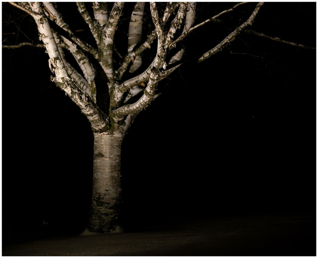
This was one of 5 possible shots. I had the rest of the family give opinions as per usual. This shot is my choice. Nobody else from my clan liked this shot.
Statistics
Place: 80 out of 96 Avg (all users): 4.9218 Avg (commenters): 5.5714 Avg (participants): 4.6912 Avg (non-participants): 5.0631 Views since voting: 1443 Votes: 179 Comments: 8 Favorites: 0
Hits: This is a good night shot; the subject is well exposed (and not overexposed as often happens). The texture of the tree shows very well, and the colors seem right. It's good you chose an off center composition for this.
Misses: The key interest in the photo is the network of branches at the top of the tree. As mentioned, the textures work well, and there's a nice "branching out" feeling. However, aesthetically, it seems to end too abruptly. I think it would work better if you could have gotten more of the branch area of the tree and include a little less of the trunk (assuming your flash would cover it). Perhaps a vertical format would help.
Ideas: One thing you could have tried which I think would have made this really a "stop and analyze" type of photo is a little trick, but legal. What if you were to flip this upside down? I think it would look pretty cool, and there's no rule against it. Maybe next time!
This photo has a lot of depth. I don't think the negative space in this photo is working to enhance the subject. I think if you'd have cropped some of that off, you could've gotten we viewers closer to the subject and even added more depth to the photo.
The tree provides an interesting shape, and the picture is nicely composed, but the lighting looks very artificial and my first instinct is to say this tree would look better in daylight.





 Add photograph to your favorites
 Add photographer to your favorites


