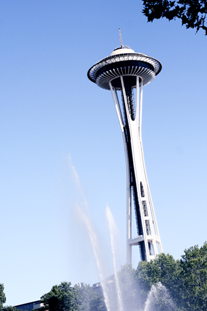
Um. In case you didn't notice, the Space Needle is a little off plumb. The picture looks overexposed. A little more contrast between the fountain and the sky would have been nice. I think most of this could be corrected by basic editing techniques, and would give you a much better photo. As an ex-Seattle-ite the Space Needle has many fond memories, and it is good to see it again.
I'm scoring this low for several reasons: The "dramatic" angle was unneccessary. The diagonal goes directly into the corner. The contrast is flat. That bit of bush to the left side is an "odd bit" (just there for no reason.) This sounds harsh, but learning composition and adjustments of colors and light are critical.






 Add photograph to your favorites
 Add photographer to your favorites


