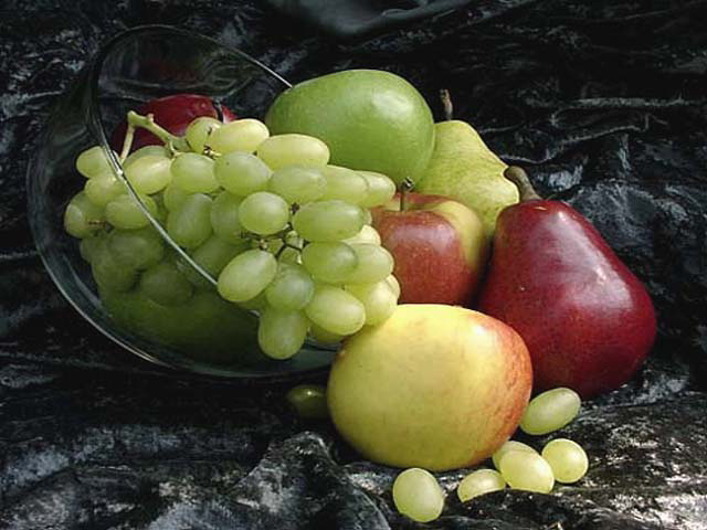
Too many apostrophes in the title (there should be zero). But my stupid grammar peeves don't matter. In the photo, it looks a little distorted, like you stretched your image to fit the size, rather than cropped it. The lighting and composition are good, you just need to work on image quality, and that looks like an editing issue here.
Good composition. The background cloth is a little distracting to me because you can see the texture, etc. Having said that though, it does give it a touch of elegance that a plain background would not. karmat
nice composition. however, the photo looks stretched...so much so that it was one of the first things i noticed. try not to stretch (or sqeeze) more than 10-15 pixels in one direction, otherwise the distortion will become evident. (7) ~mcmurma
Composition: Subject Placement, Cropping, Background very good, Technical: Focus, Exposure: a bit soft slightly fuzzy, could be the camera Appeal: the lighting is good an appealing pic Total Averaged Rating 8. sulamk
A classical nature morte ! And there is nothing wrong with that ! Very pleasing colours and composition. What's the background made of out of interest: I like the way it shines here and there. 8 whether you tell me or not. marcvg.







 Add photograph to your favorites
 Add photographer to your favorites


 Photographer found comment helpful.


