There is a lot going on in this photo - way too much.
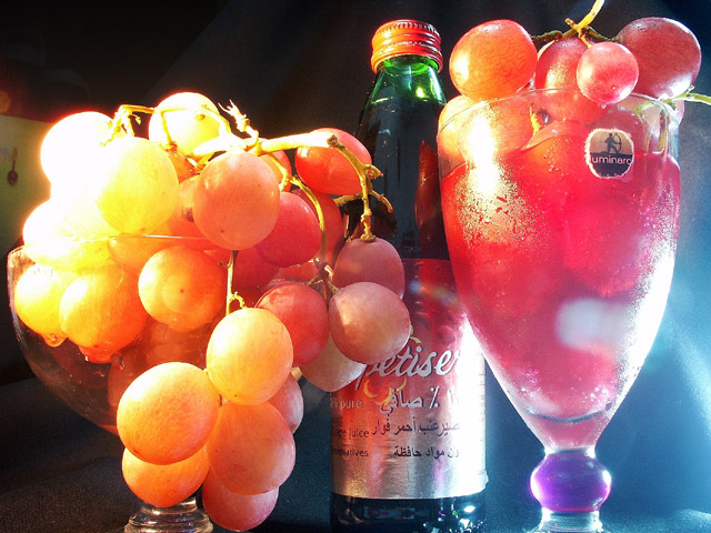
It is a great idea for the challenge and the title is perfect. I think the idea is worth reshooting to make a great photo (suppose the grapes are gone by now). The colors are great and the shapes are sensuously round - I especially like the round blob on the stem of the glass that matches the grapes.
However, the whole thing is just too busy! And unfortunately the thing that draws the eye is the screw cap on the wine bottle because it's color and focus are harsher. The rest of the photo has a lovely soft look. The cap balances the glas stem on the right and the big grapes on the left to make a visual triagle, but it's defests dominate the effect.
Obviously the lighting is a problem as many pointed out, too glaring on both sides. Pay careful attention to unwanted elements in the background, the spoon on the refrig is also distracting.
How about recropping the photo? the glass on the left isn't necessary, though it;s grapes are. the cooler blue background on the right is better than the black on the left. If you crop just to the right of that vertical stem I think it looks better. Can you get the base of the glass and the bottle back? They look cut short and the rounded shapes of both would have added to the compossition. Then take the cap off the bottle and scrape the label off the glass.
It really could have been a much better photo with a few changes. It is worth trying again. A photo is only as good as it's worst elements (sad to say). The lighting and the cropping decisiosn both spoil this one. I gave it a 4 - just below average.
I like the framing and composition of this, but hte lighting is a bit bright and distracting for me. I think a softer or more diffused lighting would work better. karmat
Cool shot, looks like an advertisement. Don't care for the label on the glass on the right, and the spoon (I think) on the white background (on the left) is distracting. lhall-7
This is a really great shot, and I think it could have been superb without quite so much glare. That's a personal opinion. Other than that, composition good, and overall the shot is interesting and subtle. (7)
Really cute idea/title. The glare on the grapes to the left is just a killer. Looks like arabic on the bottle, cool! I also like the purple on the right hand glass, but the tag near the top has got to go! 7 Swash
Very good atmosphere. I would have rotated the glass to hide the ugly Luminarc label (but for all you know there's an uglier one on the other side :-) What's inthe bottle ? 7. marcvg
I admire this one as its one I wish I could've had the time to take. I was skeptical looking at the thumb. Good thing for you we don't vote based on those. Well done!





 Add photograph to your favorites
 Add photographer to your favorites

 Photographer found comment helpful.


