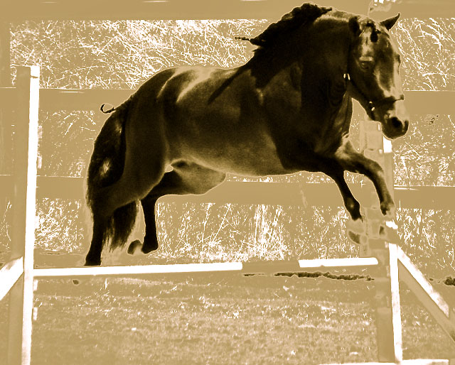
I give you "Snaps" for courage, My Friend! However, I've been here long enough to know the prevailing opinion about photography. Avante Garde ART is frowned upon & given low marks. Meeting Challenge INTENT is required for good scores. (This photo, for example, has no person hidden in the picture...that I can see. The horse is your subject right. If so, you will probably be getting alot of DNMC's because the intent was to hide a person in the photo.) Finally, muted & dark pastels don't score as high consistently as vibrant, but not overly-saturated colors. Much success to you in the future! Feel free to check out my profile after the challenge closes to see that I have made all these mistakes & learned from them. Hard lessons, but Little is Learned in Life without a 'Hard Lesson'! :)
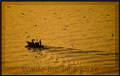
Unless I miss my quess this looks like an attept for the brown, Good luck, personally I really like this one, the browns have been overdone, the lighting is not fantastic and the overblown areas show up nicely. The one thing missing is waldo unless the horses name is waldo in which case I am sorry I did not know and may have scored it higher if I would have known.
I'm not really sure how this meets the challenge, and I'm not really sure I like the editing here either. But I can tell this is a nice clear image, and I like the sepia tones!
With the heavy processing I would expect to be able to pick out Waldo, but for the life of me I can't. Interestingly processed picture. Parts of the horse were cut off, such as hooves. It looks like you selectively processed the background. Not my style, but interesting.
Not quite sure where you're going with this. Looking forward to reading your notes behind the processing here after the challenge. I don't like it, but I am intrigued. Ok, can't see Waldo, though no doubt he's hiding somewhere in the bushes, so you get the benefit of a 4.
There may be a person in there somewhere but I can't see one. I don't think the surreal processing does justice to a beautiful animal as well as more realistic processing would have. Sorry; just doesn't work for me.
You like to go for the processed look, don't you. :)
I actually find this one rather interesting. Perhaps because the colors are way of the "natural" colors.
What a cool image; starting with a strong image itself, and processing that just makes it stand out. It makes me wonder how much I actually see the horse when horses jump, and how much I see the surroundings, what they're jumping, who else is around. I like an image that makes me think to see what's there. Nicely done.
I think this is horrible... sorry but I do. The beige colour of the background reminds me of phlegm and you've removed all the detail from the horse's fur.
The legs of the horse just look weird as you've used the effect on the hooves so it looks a bit disfigured. Also the mane looks like a block on the horses neck rather than a graceful flowing accessory.
SOrry to go on but I would have preferred this in normal colour, but then again it wouldn't be too hard to find the horse anyways. I'm at a loss.
Other than the fact that I can't, for the life of me, find Waldo, I find this a very harsh and unappealing treatment. The dark blotches below the rail and the disappearing hooves are distracting.
It may have been a lovely shot to start with, capturing the motion at the peak of her jump.





 Add photograph to your favorites
 Add photographer to your favorites


 Photographer found comment helpful.


