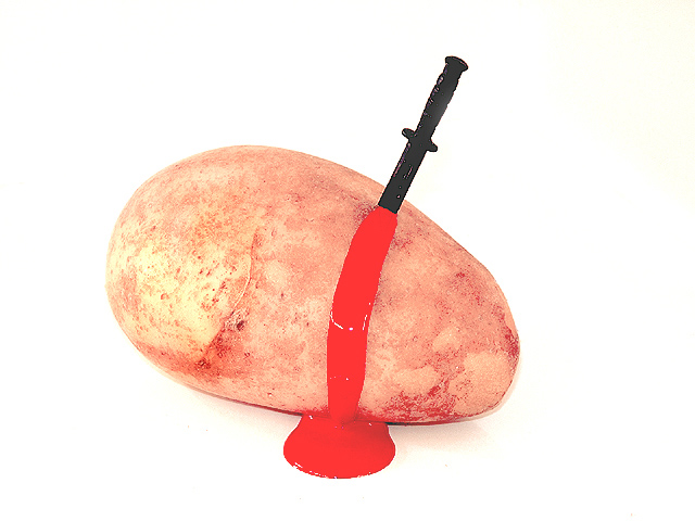
Took me a minute to get the title! The red is really bright, so that causes the picture to jump out. I think a little more detail on the knife would be good. karmat
Nice clean white background. "Blood" colour just a little tooo far away from realistic. Good that it's an original title/ idea - just not my cup of tea. Kavey
Concept is good however blood spreads in all directions. You could have hed a much better composition had the blood flow been more realistic. But good go. I like the concept.
Ugh...I think it's pretty gross. Misses the mark on being funny (or my funny photo detector is a bit off today). Red color is badly clipped (or has been painted in and lost detail), knife looks pretty photoshopped (a no-no on this site!). Sorry...this truly is one dead potato.
ouch. lol. nice play on words in the title, nice white background. 'blood' doesn't look very convincing, it is too light, and i wonder why you used such a small knife. what is that anyway? almost looks like a cardboard cutout? i'm sure that was deliberate, but i think i would've preferred a real knife. -- gr8photos (5)





 Add photograph to your favorites
 Add photographer to your favorites


