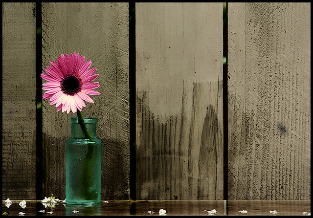
When you just look at the top part of the image, as it loads, the "rain" seems fake, like a setup almost. But when you see the whole image it doesn't look fake at all, especially because of the wet wood. This is another image where I'm thinking, why is the flower looking that way, almost like she's looking away from the image, to the side. You seem to have quite an ability to make these slightly odd compositions work just so. One thing I think works really well in this image is the colour combination, the brown/green overall, set off by the beautiful almost fluorescent pink of the flower. I like the little light sparkles in green behind the fence, they give the whole thing depth. If there's one detail that possibly could use bettering, the bottom part of the flower looks slightly off - it has a creamy yellow tone that to my eyes doesn't go all the way with the rest of the situation (but you probably know better) :)
PS - I didn't realize this was for "Negative Space" until after commenting. So that's why that placement.
Awsome! The rustic wood with the beautiful work nicely together. The color of your bottle is nice and reminiscent of the old bottles that turn green in the sun light which works nicely with the old fence. Good work!





 Add photograph to your favorites
 Add photographer to your favorites

 Photographer found comment helpful.


