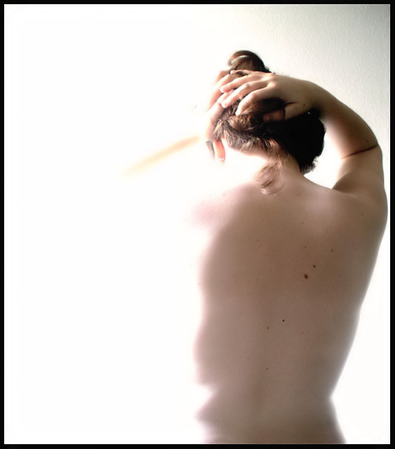
I wanted to do a nude but I just moved so the self timer came in handy. The light source is natural. As far as the composition, I wanted a balance of sorts so I cropped the subject over to the side. Also, I wanted to emphasize the appearace of being bathed or "engulfed" in light. My post-process steps were re-sizing, cropping, curves, neatimage and hue/saturation adjustment layer.
Statistics
Place: 317 out of 374 Avg (all users): 4.8500 Avg (commenters): 5.5000 Avg (participants): 4.6582 Avg (non-participants): 5.0000 Views since voting: 790 Views during voting: 276 Votes: 180 Comments: 6 Favorites: 0
A lot of people like these type of shots with the intentionally blown out areas but they're not a style I find favor with personally. I would have preferred to see at least an outline of her face.
Good example of negative space. The shapes of visible subject in turn create shapes of negative space. I don't like the composition, though, pushing her to one side like that. I see it often at dpc, and it is meaningless, or conveys a misunderstanding of negative space.
the negative space has some depth, which is good. Focus is just a little softer than I would like it (I love soft focus images and do a lot of them but I'm not sure this works here). The black border is distracting and overpowering - I think that is why I have a problem with the soft focus. Works for the challenge. 6






 Add photograph to your favorites
 Add photographer to your favorites


 Photographer found comment helpful.


