Didn't do to many critiques the last few months, but was glad this image popped up.
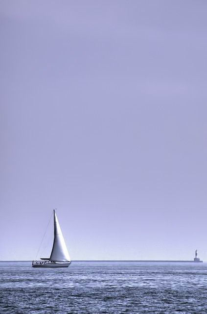
It's a happy picture, with good use of negative space.
I dont know excactly why this didnt go any higher then 59 place, but sometimes you just dont know @ dpc.
A little more contrast maybe would have worked and maybe the lighthouse would be a bit distracting for some people.
But overall I think this is a strong picture.
This is BEAUTIFUL! This is exactly what comes to my mind when I think of the perfect Negative Space photo. The cool blues make it especially appealing to me! This is my favorite one so far.
What a pretty color choice. Great aspect and nice use of neg. space. You kept enough of the foreground to not lose sight of the subject matter. Some have struggled with that issue in this challenge.
If this is a duotone or colour, it really works with the overall tinge of blue. I like that there is something off to the right, and not the typical single subject with space all around. Pretty!!







 Add photograph to your favorites
 Add photographer to your favorites

 Photographer found comment helpful.


