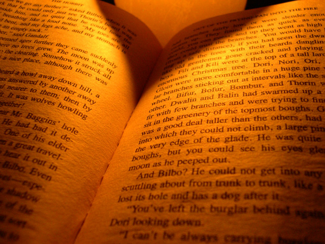
I very much like the glowing warmth and crisp texture of the paper. Good composition apart from the distracting dark shapes at the top. It's more potent with these cropped out.
wasn't it a great book? i usually don't like the pictures of text, but you made it interesting with lighting which looks like fireplace glow and gives the whole picture a warm feeling... 6.
Yeah, but you should be reading photography text books...lol...not The Rings.
Image is too orange/yellow for my tastes and I don't like the shadow at the top.





 Add photograph to your favorites
 Add photographer to your favorites

 Photographer found comment helpful.


